Keeping the art of the film poster alive: What’s the idea with Dylan Haley
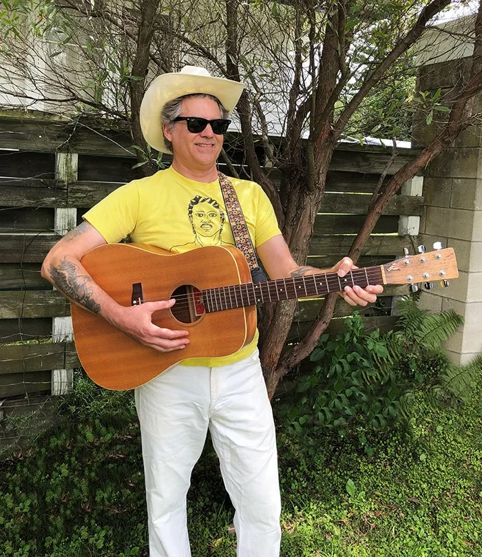
Dylan Haley (pictured above) is a graphic design and movie poster artist with a flair for the understated.
In this conversation with graphic designer Dylan Haley, we breakdown his path to becoming a movie poster designer, his process for creating the posters, and the importance of giving your best effort for every project. We also discuss his various posters for Arbelos Films and Canadian International Pictures, among others.
Thank you for meeting today. Do you mind sharing where you grow up, and were you into art or drawing while growing up?
I'm from Berkeley, California. That's in Northern California, right near San Francisco. I was into drawing; I never thought of it as a career, but it was the thing I was into and what I was good at. When it came time for college, I didn't know anything about jobs you could do in the creative world, so I just went to art school to be an artist, like a painter. I quickly changed majors to illustration because it was too free-form in the fine art department. You could just do whatever you wanted and I felt like, fuck, I want to get an education here. I can be creative on my own time.
Did you have any particular goals for your career?
The whole story of my career is not anything I planned. I ended up learning Photoshop, which was brand new when I first was in school. I never owned a computer—I was kind of anti-computer, I guess—but I could see all the cool kids were going into the computer room, and I could see stuff on the screens that looked cool, so I was just like, fuck it, I'm paying all this money to go to this school. I should take a computer class. I ended up taking a Photoshop class, and I had a very cool teacher who was not overly interested in the computer either, but it was a tool for him to make art that he was into. That spoke to me right away.
When I got out of school, I got a job at this Internet company, and I didn't even know what the Internet was. It was a company that built websites for other companies, so I just designed websites in Photoshop and then a programmer would make them. This was in New York, where I had gone to school.
“Ei [Toshinari] was very serious about aesthetics. He didn’t want some lame poster with the actor’s face and the title at the top. He wanted something creative, and he really got me thinking about things in a different way. That was kind of the beginning.”
Then, when the Internet bubble burst, I got laid off from my job and moved to L.A., and I just ate shit for a while. I ended up freelancing and became this general graphic designer. I was really a jack of all trades. I learned how to make websites, I did business cards, T-shirt graphics, just anything anyone needed. This was right after 9/11, and George Bush was just pouring gasoline on the economy, so suddenly everyone was starting businesses and making money, and everyone needed a website, everyone needed everything, and I was a guy that would do whatever you wanted.
How did you get involved with movies?
I ended up working for this company called Cinelicious in Los Angeles that did post- production and colour, and then they got into doing film restoration as well. They opened up a film distribution branch company called Cinelicious Pics, and that's how I ended up starting to do film posters. I did the website for them and their business cards as well.
They were cool, but they ended up going under. It was kind of a tragic end to that company, but two of the guys there, David Marriott and Ei Toshinari, started a new company called Arbelos Films. They took over the film contracts that had existed for Cinelicious. The first movie that they did themselves was The Last Movie starring Dennis Hopper, which was such an honour to work on.
I really liked working with them, specifically Ei Toshinari. For a lot of the work I'd done before, I was always a small operation, just one guy, so I didn't necessarily work on projects with huge budgets where I could just spend months on a logo or something. Banging things out was what people wanted to pay for. But Ei was very serious about aesthetics. He didn't want some lame poster with the actor's face and the title at the top. He wanted something creative, and he really got me thinking about things in a different way. That was kind of the beginning.
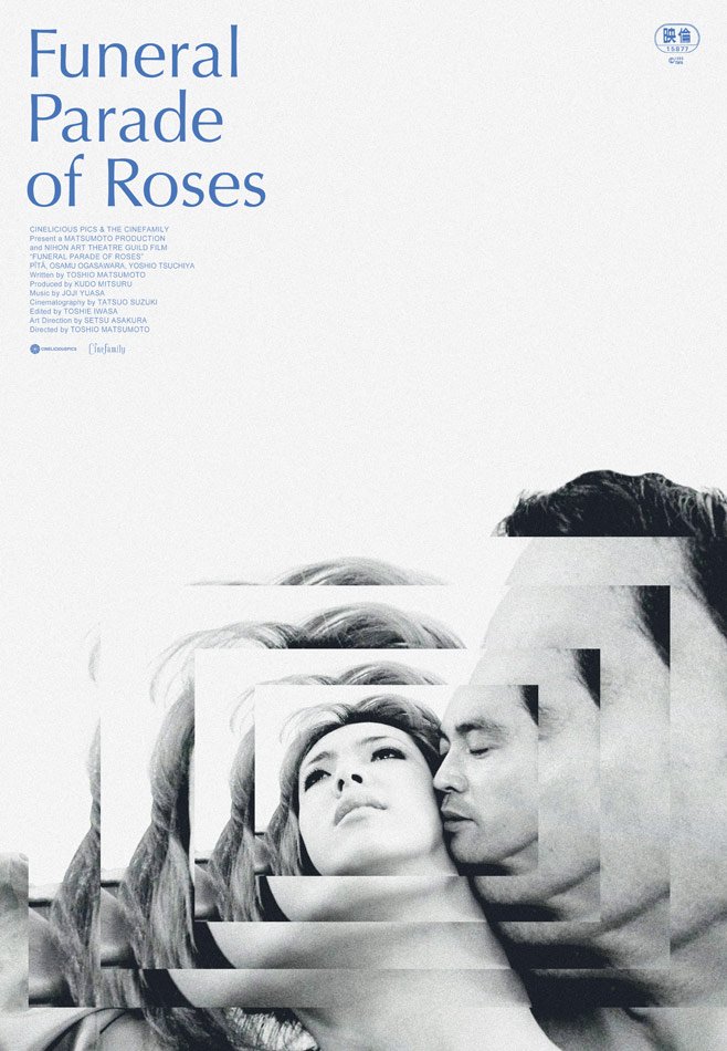
Haley’s poster for the Toshio Matsumoto film Funeral Parade of Roses.
Ei and I worked on a poster for Funeral Parade of Rose that was the first poster that I got really excited about doing and where I started to see how “cool” working on posters could be. He wasn't going to settle for something less than what I ended up delivering, and I was really happy with how it came out. The movie is also amazing, by the way. The poster got into Film Comment magazine , which was a lot of fun for me.
I feel like I'm better at doing the movie poster thing than other facets of design. It was just a good fit for me. My brain likes it, it works, and on a side note, I've always been this closeted film fan as well. I didn't necessarily know much film history, but I would just constantly go to the video stores wherever I lived and get random movies, so I did have this film background, even though I didn't really think of it that way.
Then other people started finding me on Instagram or through Arbelos. I honestly can't believe that. I still do other graphic design things now, but Blu-rays and posters are the bulk of how I make my money now and are also my favourite thing to work on.
Were the posters that you were designing in the early days for theatrical or home video releases?
Both. All the Arbelos and Cinelicious films came out in theatres as well as Blu-ray.
For something like The Last Movie, then, would that have been to promote a re-release?
“I try to make a poster look good enough that it could live on someone’s wall... Why put something that sucks into the world, you know?”
Yes, most of Arbelos' films were re-release posters, which was the model for Arbelos because they had a guy who was doing restoration. I'm doing these vintage posters so I want them to look a little vintage. If you look at the older posters, I think most people would agree that quality has gone down in recent years. The old ones look better, and I'm working on an old movie anyways, so let's make it look old. But there is a way that you want to do it where it doesn't actually look like a poster from that period. You want it to look old but new at the same time.
I try to make a poster look good enough that it could live on someone's wall. It's not always possible, because some movies just aren't going to be that kind of movie necessarily, but that's what I’m hoping for. That's my business model too. I don't really count the minutes when I'm working. I want to make it good because I want to put something in my portfolio and it's like, money's being spent, my time's being spent, this thing's going to be printed. Why put something that sucks into the world, you know?
The artwork is a big part of the argument for physical media. I think back to the classic records of the ’60s and ’70s, and the album art is so essential to it. Same thing with a lot of classic film posters. Something like the Alien poster is an essential part of what defines that movie.
Absolutely. I find that the filmmakers who find me, even on small films, want a good poster. It's a pleasure to work with people like that. They're not just wanting me to crank something out. Hopefully the poster won't go away completely. Now they have LED screens at movie theatres, so there is a poster, but you can't touch it or anything.
I was talking to a printer about printing posters on paper that's not that plastic-feeling magazine paper. With the old posters, you touch them, they feel like they're actually on paper, while the new ones are all glossy. If you put them in a frame, they often get warped, and if the lights shine on them, they look like crap. I'm a big fan of everything being printed matte, not glossy. But I've given up on this dream of better poster paper. It doesn't seem to be in the cards. Arbelos has done some short runs, maybe 10 or 20 posters—they'll do them digitally at a copy place—and those are actually good. It's matte paper and a thicker paper, and they're nice. The Life Is Cheap… But Toilet Paper Is Expensive poster that I did was printed as a shorter run, and it came out really good.
Is there an era of film posters that you try to harken back to or any artists that particularly inspire you?
Definitely the ’70s. The guy who did the Cool Hand Luke poster, Bill Gold. He had a studio, and he did the Dirty Harry posters, too. He did a bunch of Clint Eastwood movies. Some of them are illustrated and some are just using photos. I love those, especially a lot of the way the type on the credits is done. I ripped those off.
And then the other guy is Hans Hillmann. A lot of the posters he did were movies that were not necessarily made in Germany, but he would do the German release posters for them. He's just incredible. I absolutely worship him.
Other than that, there's also tons of current people on Instagram who are keeping it real and doing great work. I have a little community, like Midnight Marauder. There's another person, BAM Creative. She's really good. There’s a guy named Sam Smith. I'm leaving so many people out…
I would actually love to meet some of these people because it's a funny thing, I'm following their careers and are all kind of in the trenches doing the same thing, but I'm in New Zealand. I work for a few people in Europe, but most of my clients are in Canada.
I’ve worked for a bunch of Canadians who are such amazing filmmakers. I've become “virtual” friends with some of them, but I have never even met them in real life, and it kills me. So, one of these days, I definitely need to come to Toronto.
Oh, wow. Based on your work, I assumed you were somewhere in North America.
Everyone thinks I'm from Canada. I did the poster for this movie Anne at 13,000 Ft. for the Toronto International Film Festival (TIFF), and it was kind of a quicky job, but I put some thought into it, and the poster came out good. They liked it, and then the movie did really well. People really liked the movie and the poster, and from then on, all these Canadian people have kept hitting me up, and I've just kept working away. Chelsea McMullan and Sean O’Neill did the film Swan Song. They're people I would love to meet. They're very cool, and working on Swan Song was such an honour. It was so intense working on that movie, and they did such a great job. It won the best Canadian film at TIFF that year, so it was a great accomplishment.
I also worked on the Canadian film Paying For It. You should see it. It's a movie by Sook-Yin Lee . It’s an adaptation of a book by Chester Brown. He's a graphic novelist from Toronto who was well liked in the ’90s, and he did a comic strip chronicling his real life, among other things. He started going to prostitutes instead of finding a girlfriend to sleep with him, and he found it a very positive experience. It's a really cool movie, and they really show Toronto. I feel like they really captured that ’90s Toronto vibe. There's a lot of Toronto love in that film.
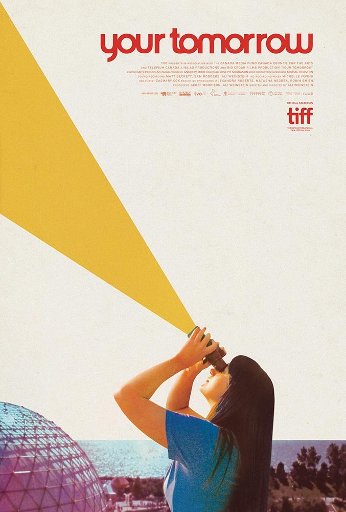
“I did this film poster for Your Tomorrow, which is about the park Ontario Place. That's a really interesting documentary. I feel like I'm really learning about Toronto. There seems to be lots of cool people doing cool things there”
At right around the same time, I did this film poster for Your Tomorrow, which is about the park Ontario Place. That's a really interesting documentary. I feel like I'm really learning about Toronto. There seems to be lots of cool people doing cool things there, so I'll get over there one day.
Please do! How did you meet the people from Canadian International Pictures (CIP)?
David Marriot, the other co-owner of Arbelos Films, is old friends with John and they are now doing CIP together, so I was just brought on because I was already working with Arbelos.
My whole trip has been word of mouth. If I made a website for someone, I'd put my link in the contact section and people would find me that way. Now people find me on Instagram sometimes, or maybe they see something I did and somehow find out who I am. I've never really understood how to promote myself. I've spent a massive amount of time making a website and then notice no difference whatsoever in terms of work, so I don't know how to tell a young person how to break into the business.
The editor Erin Brenner explained in her book that a form of marketing can be to build a good reputation and be reliable and be somebody who people want to recommend. It sounds like that's what you did.
That is what I did. And I will say this: when I was younger, I had a shitty attitude and didn't even realize it. I thought I was hot shit. You would hear about how this company paid $50,000 for their logo and this guy only wants to pay me $300, and it’s like, “I am worth so much more than that.”
I realized two things. One is if you don't want to do it for $300, then don't take the job. But if you're gonna do it for $300, do a good job, because it's not fun to just rush through something and try to get it done. And second, it's just not good for your soul or your mind. And then they're not happy. Nobody's happy.
If the only work you can get is some shit job for $300 and you need the money, then just put everything you have into it, because they can give you another job, or they can recommend you to a friend. It's just good, no matter how you look at it. And like you said, be reliable and just be attentive. Even if I'm running behind or if I'm busy, I send an email and don’t just ghost people. Let them know that you haven't forgotten about them. It's like the golden rule, I guess. Be the employee that you would want if you were hiring somebody, and just have some gratitude that anyone's hiring you at all.
Some of the posters and some of the movies I like more than others, but even if a movie isn't necessarily 100% my thing, it can still be a good poster, and I can still deliver something that they want. Sometimes I will do a few mock-ups and they don't pick the one that I like the best. That's okay too. I'm here to do a service, and if they're happy with it, great. Sometimes I'll put a mock-up that wasn't picked up on my Instagram just so it doesn't go completely to waste.
It's funny because sometimes with the people I work with more regularly, I get in arguments with them because I'm like, "No, we’ve got to do this.” Ei Toshinari, who I was talking about earlier, I've worked for him for so long, and sometimes we'll butt heads and he's like, “Are you like this with your other clients?" And I'm kind of not. I don't know why I'm like that with him so much, but things go differently with different people, I guess.
When Ei and I work together, a lot of times he'll be on a Zoom call and I'll share my screen, and we will kind of make it together. That's pretty unusual. I sometimes tell people we could do that, but usually people don't actually want to do it. So maybe that's why I end up getting into these arguments.
“That was such a daunting film to do a poster for, because how do you turn an eight-hour movie into a single image?”
That's really interesting to hear that you're designing the posters together. Are there any posters that stand out from collaborations with Ei?
It's not so much that we're designing together from start to finish. It's more like I'll do it, but then he'll want to look at it, and he'll ask to see something in a different colour or want to try making something a little bit bigger. We just did a poster for this film, The Sealed Soil. We definitely had the share screen going on that one, and we were trying some things. He gets into it, and I don't mind. It's an interesting relationship because he thinks a little bit differently than other people. Sometimes that's a good thing, and then other times it can be complicated. Creativity is a funny thing.
He keeps calling you for more posters, so you must have been doing something right, even if you were butting heads.
Yeah, and we're buddies, too. I’ve been nicer to him lately, I’m probably making this sound worse than it is… you’ll have to get his side of the story, maybe. But he's really pushed me to do some things. One of the best was the Sátántangó poster. So that image of the girl poking her head out, he's the one who picked that image for that, and then I had the idea of the rain on top and the leaves as well. He actually had a big hand in that one. There's kind of like mud and dirt and leaves at the bottom, and he might have suggested putting that on there. I can't remember, but I think I was literally on the phone with him, and I went outside and put a bunch of dirt and leaves on a piece of paper and took pictures of it. We did that poster very quickly, and that's one of my more liked posters.
That's obviously such a great movie, too. And that was such a daunting film to do a poster for as well, because how do you turn an eight-hour movie into a single image?
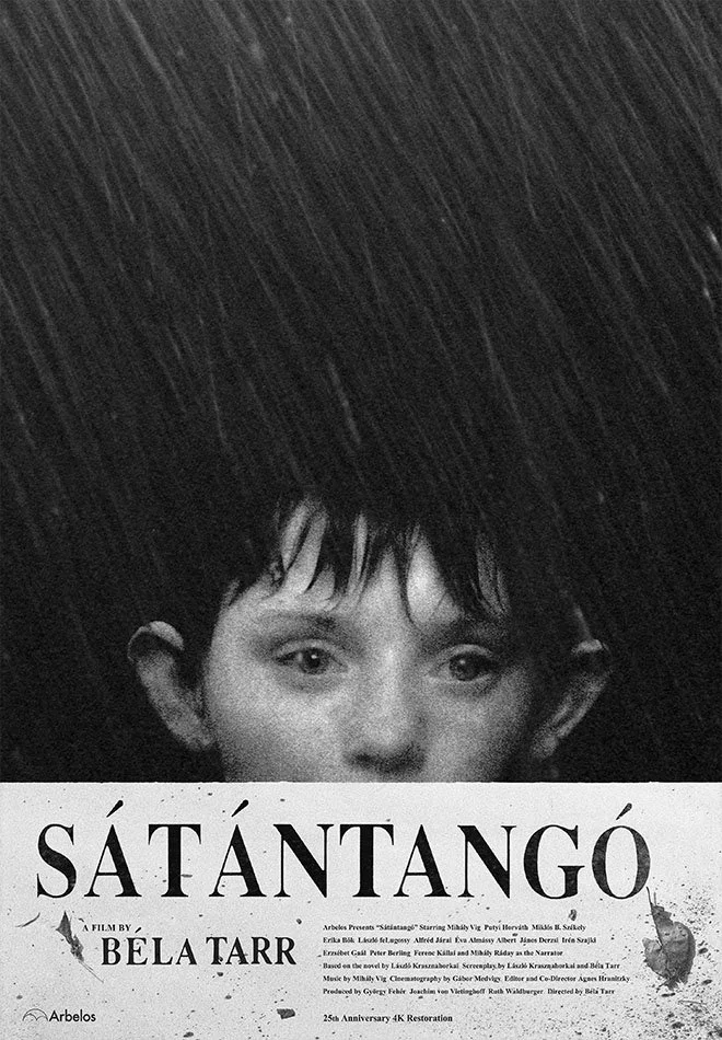
Haley’s poster for Bela Tarr’s acclaimed film Sátántangó. Dylan “wanted the weather and the mud and the dampness to be in the poster.”
How did you go about thinking of that?
With any poster, it's like you're turning a whole movie with potentially lots of different characters and things happening into this single image, so it really comes down to just solidifying what is most significant in the film, and also maybe what's most visually interesting.
With Sátántangó, there are a bunch of characters in that film, but the girl is the one you keep coming back to. The other thing about that movie is it's just raining the entire time, and they're walking through this shitty landscape. It's just mud, dirt, and these poor conditions they're in. The weather is almost in it more than any one character is, so I really wanted the weather and the mud and the dampness to be in the poster. And then also I was trying to give it a little bit of that Eastern European kind of vibe. That's another huge influence, all the Czechoslovakian posters and Polish posters.
But yeah, that's the thing. You can't tell the whole movie, but you can express a feeling. You're winning if you can get the feeling of the movie.
What's the Idea: Thank you for sharing that explanation. It’s interesting, the contrast of that movie with something like your poster for Life Is Cheap… But Toilet Paper Is Expensive.
That was an example of a movie that lends itself to making a cool poster because it's just visually a very cool movie, and it's a very off-the-wall movie. There was a lot of license to just make it cool and crazy and not have to hold back. I haven’t really talked about this either, but I like the negative space. I try not to bombard things too much. I prefer these flat backgrounds.
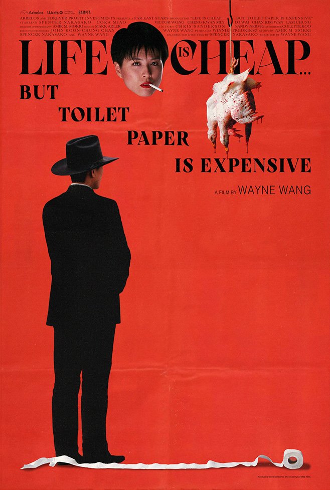
Haley’s poster for Life is Cheap… But Toilet Paper is Expensive, a 1989 black comedy film directed by Wayne Wang.
I'm particularly proud of the credit block on this one because it went around the woman's head at the top. That took forever to get right. We had to change names around, and it goes around the hook that the ducks are hanging from as well.
For the Blu-ray, that's just a shot from the movie. He's Chinese-American, but he's in Hong Kong, and they're kind of playing with this West vs. East thing. The toilet paper itself is not in the movie, but that's obviously the title of the film. That woman with the cigarette is like the boss man's lady. She is also the director’s wife in real life. I just wanted it to feel cool.
I took a picture of that roll of toilet paper, which is kind of like the cherry on top. I had a roll of toilet paper that I put on the ground. I had to take a bunch of pictures to get it just right, and then I just put it on top of that picture of the film. But a film like that is so outrageous, so you want the poster to make a statement and not just be some random poster. You want it to let people know what they're in for.
You touched on a part I wouldn't have thought of, which is the text, like the credits on the posters. Is that part usually difficult to figure out?
Not always, but that one was, and then also on Murdering the Devil, where it goes around the devil's bowl at the bottom. That took me much longer than normal. I was definitely looking at some Bob Gold posters when I did that one.
But in general, the credit block is definitely part of the design. A lot of times people will hire me and they don't think to get me the credit block right away because they just don't think of it. It does a lot more of the heavy lifting for some movies. With a lot of older posters, there's this little small print in the corners and it'll say “shot with Panavision” and there's some copyright, and it just looks good. Everything that's on the poster is an opportunity to be cool or not cool.
Interesting. So elements like the actor’s names and other text are essential to you, not a consequence of marketing or something like that?
Those are the building blocks of the poster. I embrace all of that. Interestingly, I've done almost no posters that have quotes on them. I wouldn't say they ruin posters, but you'll see these posters that have five quotes on them and it's just like, “Jesus.”
In the ’70s, you would see a lot of posters that had subtitles. So it'd be that Dirty Harry poster or something, and it would be like “Dirty Harry: A man who's been pushed too far.” Sometimes that can be really good, especially in a movie where it’s just really hard to communicate what it's about with just visual things. I'm single-handedly trying to bring taglines back because nobody thinks about using them anymore. Especially if it's an action-y kind of film, I think there is totally a place for them.
This other poster I did that used a tagline of sorts was The Feeling That the Time for Doing Something Has Passed. That movie was difficult to do a movie poster for, but the title is just so interesting. The movie has all these serious elements to it, but it's also this very dry comedy at the same time. Anytime we did something that looked silly or funny on the poster, it just didn't feel like the movie, but if you showed something on the poster that looked serious, then it didn't feel like a comedy either. So, we used this mostly serious image and then I just put the title on—very big and basic—and then we added: “a comedy by Joanna Arnow.” That almost becomes the joke, that it doesn't look like a comedy but you're telling them it's a comedy.
That’s pretty funny, and it’s a stunning design. I'm looking at the Looking for Mr. Goodbar slipcase here on your Instagram. Was that your first time working with Vinegar Syndrome?
It was definitely an honour to work on that one, and I was happy with how that came out and that they liked it and everything.
All of CIP’s releases are with Vinegar Syndrome, so I have the template and everything, but from them seeing that work, they have me doing some jobs for them as well. That was kind of a bigger, more prestigious job than other ones, so I was stoked that they asked me to do that one.
They're interesting to work for because they are just cranking out the movies. They're a real production line, but they find good people and then just let them do what they want to do. There's really not a lot of back and forth. I'll just do something that I like, make sure it's cool, and then I give it to them. And so far, they always just like it. They're very awesome to work for, they're a great company, and they put out some great packages and some wild films.
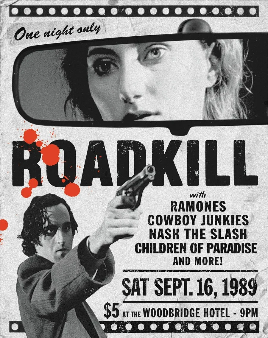
Haley’s poster for the Canadian International Picture Blu-ray release of Road Kill, directed by Bruce McDonald.
Between the Vinegar Syndrome main company and the partner labels under OCN, there’s almost an entire sub-industry there alone. They’ve got so many movies coming out every month.
It's amazing. I think it's actually a really great thing for the world of film and collecting. Not every company is going to be The Criterion Collection. There's a place in this world for what they're doing, and they're putting out some awesome stuff.
I really appreciate CIP's mission to uncover and champion Canadian movies for international audiences, along with Canadians like myself. They likely couldn't do that as effectively without the reach of a company like OCN.
Totally. It's really a good situation. I don't know the whole business arrangement with them, but obviously it's working, and I agree, it's awesome. From working with them, I kind of saw more how Vinegar Syndrome works and their whole philosophy and stuff, and it's very cool. What CIP is doing is super cool, too. I don't know any of these movies. I worked on the movie Roadkill, and I couldn't believe I hadn't heard of it because that movie is just so up my alley. Great film!
I hadn't heard of Roadkill either, and it’s such a great movie. It fits so perfectly with classics like the films of Jim Jarmusch or Kelly Reichardt .
I totally agree. Or even a movie like Repo Man. It's not exactly like Repo Man, but I think the ’80s independent cinema was way more wacky and just kind of out there, like the films of John Waters. These were movies that literally couldn't or wouldn't be given wide releases because there was drug use or they were just too irreverent. I devoured all of those movies when I was younger and I'm like, how did Roadkill not get on my radar? It's Canadian racism, plain and simple.
The limited edition sold out almost right away, so I’d say your design did well for them.
I think it was their best and fastest selling release. I don't do all of their releases, but I will do the layouts for them even if another artist does the cover, and then every now and then, they'll have me actually design a cover too. They had me do that with Roadkill. I might have had a chip on my shoulder if they hadn't had me do Roadkill because that is a very cool movie. I actually do a film night down here in the town that I live in. I live in a very small town, and there's not the same amount of film knowledge here as in some other places. I showed Roadkill, and it was a big hit.
I'm sure the director would love to hear that. That's awesome. So at this point, you generally know what your work schedule looks like on a monthly basis with them?
Every month I do another release for CIP, and we have it pretty figured out at this point so it doesn't take a huge amount of time if I'm not designing it. It's great to have regular clients like that.
To compliment them quickly, they pack an unbelievable amount of features on a disc, and the booklets and art are always high-quality.
They are definitely in it for the love. They make sure they do everything they can to get everyone's name right and properly credit people. Some of the filmmakers have practically been on their deathbed, and they end up getting this last interview with these people whom no one even wanted to talk to for years. They've done some great work. It’s a pleasure to work for those guys.
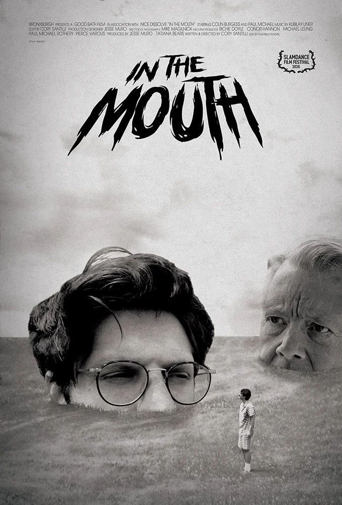
Haley’s poster for the 2025 film In the Mouth, directed by Cory Santilli.
Beginning with The Last Movie, you’ve had the chance to work on some interesting movies.
I have, and I’m grateful. Have you seen The Last Movie?
I have, yeah.
You have? Insane. I mean, I love that movie, but it is so far from a perfect movie. There are scenes where they're clearly drunk. You can see why it didn't do well, but it's an amazing movie. That was a movie you literally couldn't watch for years, and it's such a historically significant film because it's like, that and the Manson murders, and I guess the concert at Altamont, all represent the death of the dream of idealism of the ’60s. I think it almost bankrupted the studio.
Are there any projects or anything else you’re working on that you wanted to highlight?
This one movie, In the Mouth, was really good, and I didn't get as much love for my poster on Instagram as I was hoping for [sigh], but it's a very cool movie. I feel like that's got a little bit of the old Jim Jarmusch or John Waters kind of ’80s indie vibe to it. It's quite irreverent as well. It’s nice to see someone making an “underground” feeling movie in 2025.
I feel like we went through a really pretty serious decade there in film going, and there's now some fun sneaking back into movies, which is really nice.
I think independent films kind of changed because they started getting picked up, so then suddenly people started making them hoping they would get picked up, whereas I think in the ’80s, they were being made knowing that they would never become a major picture. It was like punk rock or something.
Being able to do your own thing without thought for the audience of the future can produce some amazing art. Well, thank you again for that breakdown and chatting with me. It's really interesting to learn how you do everything that you do.
Thanks for having me. It's fun to talk about it.
Follow Dylan on Instagram to keep up with his latest work, and check out his website.
If you enjoyed my conversation with Dylan Haley, you can read more interviews from the “What’s your idea” interview series.
The interview was recorded using Google Meet in August 2027.
The transcript was edited by Matt Long, with additional copy editing by Anthony Nijssen of APT Editing.
All photos are the property of Dylan Haley and used with his permission.